
Raijin
Raijin
Rebuilding a design system and improving color accessibility for a fintech app.
Overview
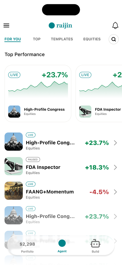
Raijin is a fintech app that allows users to explore AI-powered trading agents and track their investment performance.
I focused on two areas to improve the existing product:
Design System
The app had no editable Figma design files. I used Codex and Figma MCP to create a reusable design system that supports consistent UI design and future iterations.
Accessibility
Some of the original UI colors had insufficient contrast. I refined the color palette to improve readability while preserving Raijin's visual identity.
Design System
Building a Reusable Design System
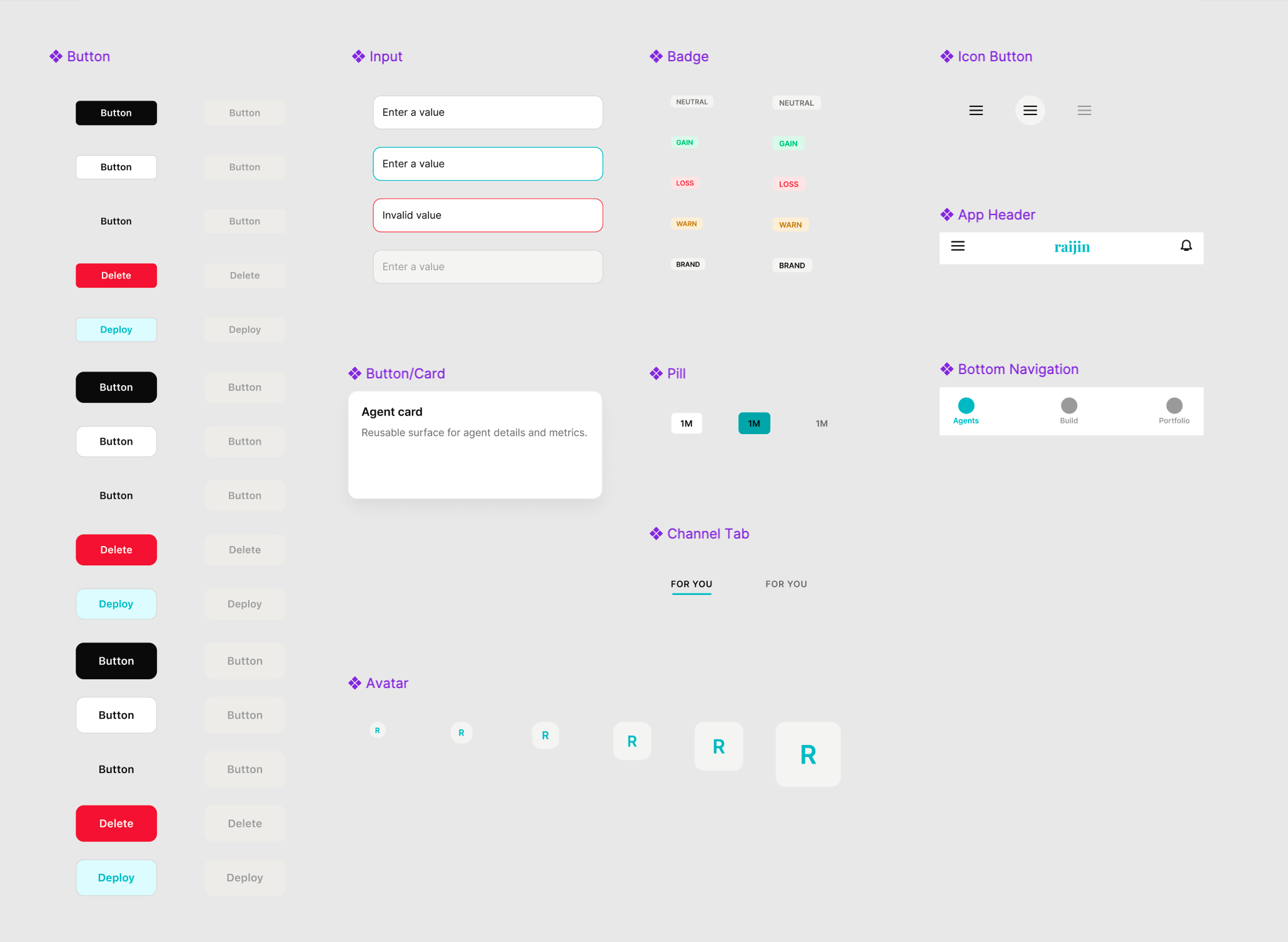
Using Codex and Figma MCP, I recreated the app's design foundations in Figma, including colors, typography, spacing, and reusable components.
This made it easier to explore design changes and maintain consistency across screens.
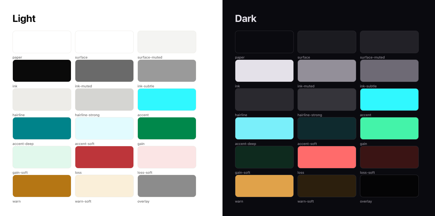
Colors
Organized semantic color tokens for light and dark themes, including backgrounds, text, accents, and status colors.
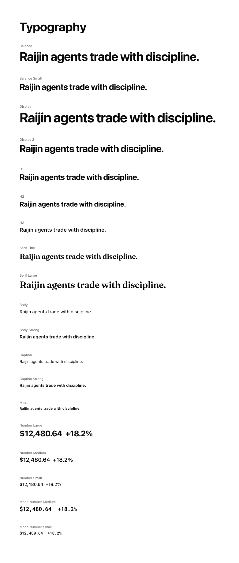
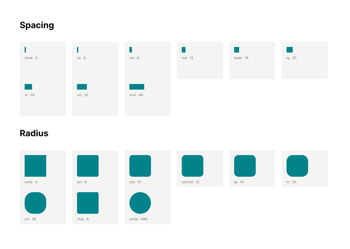
Typography, Spacing & Radius
Defined typography styles, spacing, and corner radius tokens to maintain consistent layouts and visual hierarchy.
Components
Created reusable components for buttons, input fields, badges, navigation, and cards.
Accessibility
Improving Color Contrast
While reviewing the existing UI with Adobe Express Contrast Checker, I identified several colors that did not meet WCAG AA contrast requirements for regular text.
I adjusted the colors to improve readability while keeping the original visual style.
Color Contrast Comparison
WCAG AA · 4.5:1Refined colors to meet WCAG AA contrast standards for regular text.
Teal
Green
Red
All ratios are calculated against white (#FFFFFF). WCAG AA requires a minimum ratio of 4.5:1 for regular text.
Final Design
Refined Home & Portfolio Screens
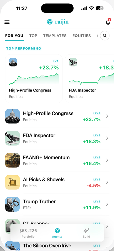
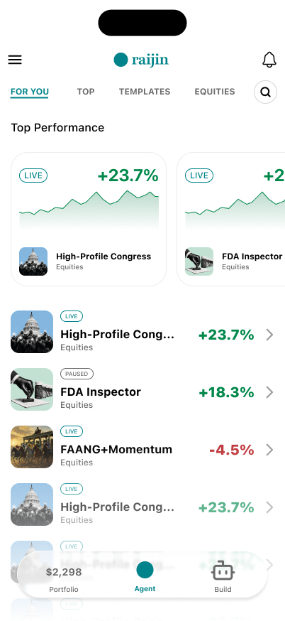
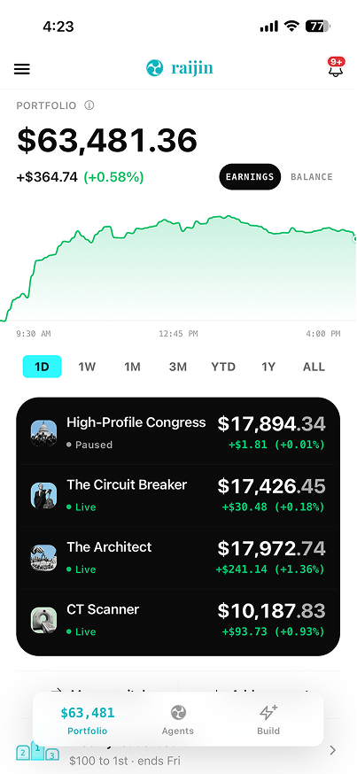
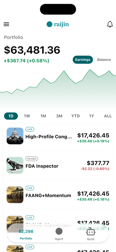
I applied the updated palette to the Home and Portfolio screens, focusing on financial values, status indicators, and navigation elements.
The changes improve color contrast while maintaining the app's existing layout and visual identity.
Home
Portfolio
Takeaway
Designing with AI and Accessibility in Mind
This project showed me how AI-assisted workflows can help bridge the gap between an existing product and an editable design environment. Using Codex and Figma MCP allowed me to establish a reusable design foundation without starting from scratch.
It also reinforced the importance of considering accessibility when refining visual design. Small adjustments to color contrast can improve readability without changing the product’s overall identity.