
BetterHelp
BetterHelp
A UX case study on improving BetterHelp’s onboarding experience
Overview
Improving the BetterHelp Onboarding Experience
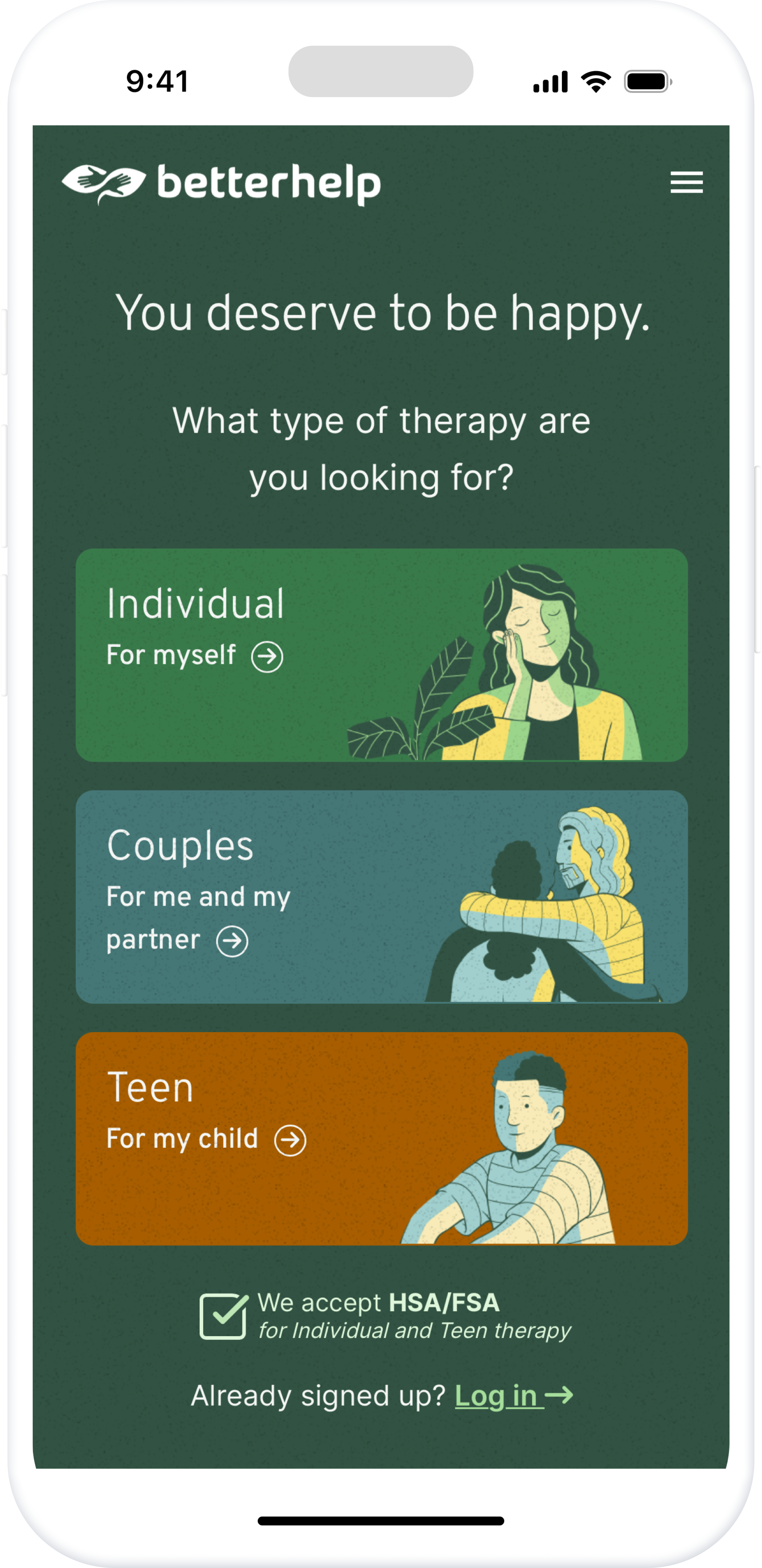
BetterHelp is an online therapy platform that connects users with licensed therapists. This project focuses on simplifying its onboarding process to reduce frustration and help users complete their setup.
Problem
BetterHelp users need an easier onboarding process because a complicated experience may discourage them from completing setup and providing important information for therapist matching.
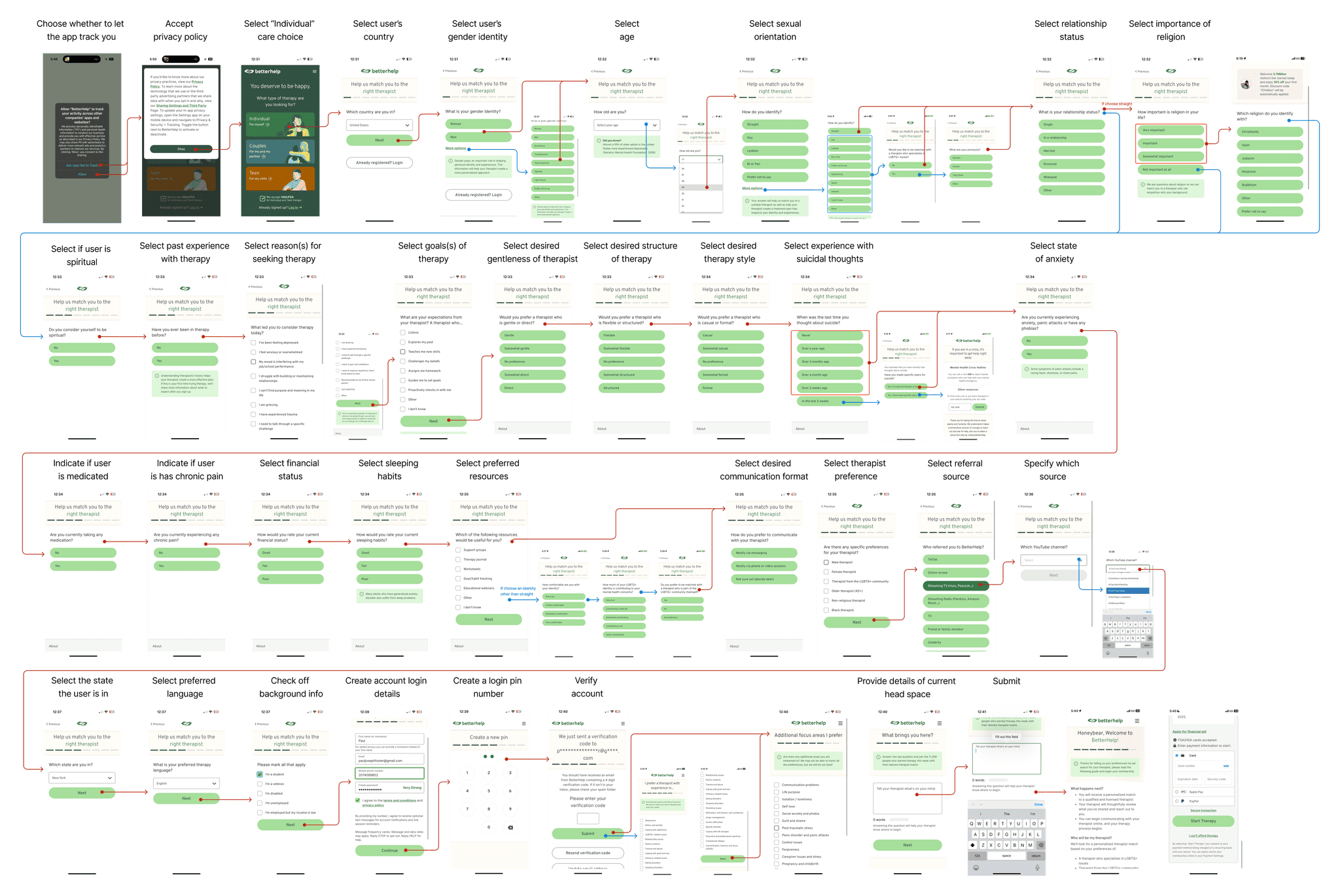
The Existing Onboarding Flow
38+
screens in the current onboarding flow.
No Break Points
The flow offers no clear stopping points.
Unclear Progress
Users cannot easily see how much is left.
HOW MIGHT WE
How might we make the onboarding process easier to navigate so that users feel more motivated to finish or able to jump back into it, rather than feeling overwhelmed by the length of the process?
Hypothesis
We believe that incorporating clearer stages to the onboarding process, and a way to navigate them, will encourage users. We aim to avoid cognitive overload and user frustration. We will know this is true when we observe a high onboarding completion rate.
User Research
Understanding where onboarding becomes overwhelming.
5 interviews
We conducted five user interviews to map out individual user journeys through the current BetterHelp onboarding experience. These conversations helped us better understand how real users perceived and interacted with the flow.
Key Insights
Cognitive Overload
The length of the onboarding process often felt overwhelming and mentally exhausting
Abrupt Emotional Shifts
Users experienced tonal whiplash, noting how the questions shifted abruptly from administrative to deeply personal topics without clear transitions
A Need for Flexibility
Many expressed a desire for more flexibility and clarity throughout the experience
User Archetype
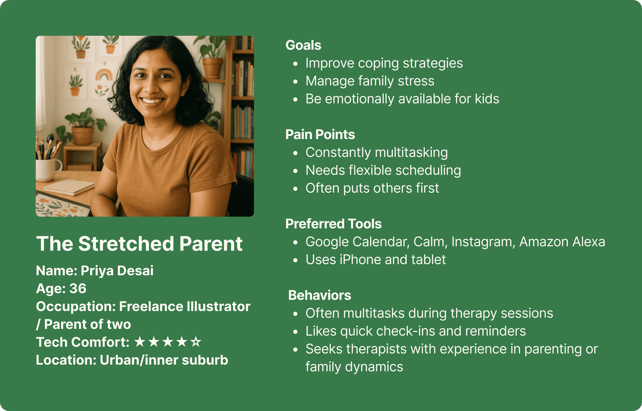
These patterns led us to develop a focused user archetype, “The Stretched Parent,” to represent a key segment of our audience. We also created user stories to reflect their specific goals, frustrations, and needs.
Task Analysis
We mapped BetterHelp's onboarding flow into 7 stages to understand its complexity and the information users need to provide.
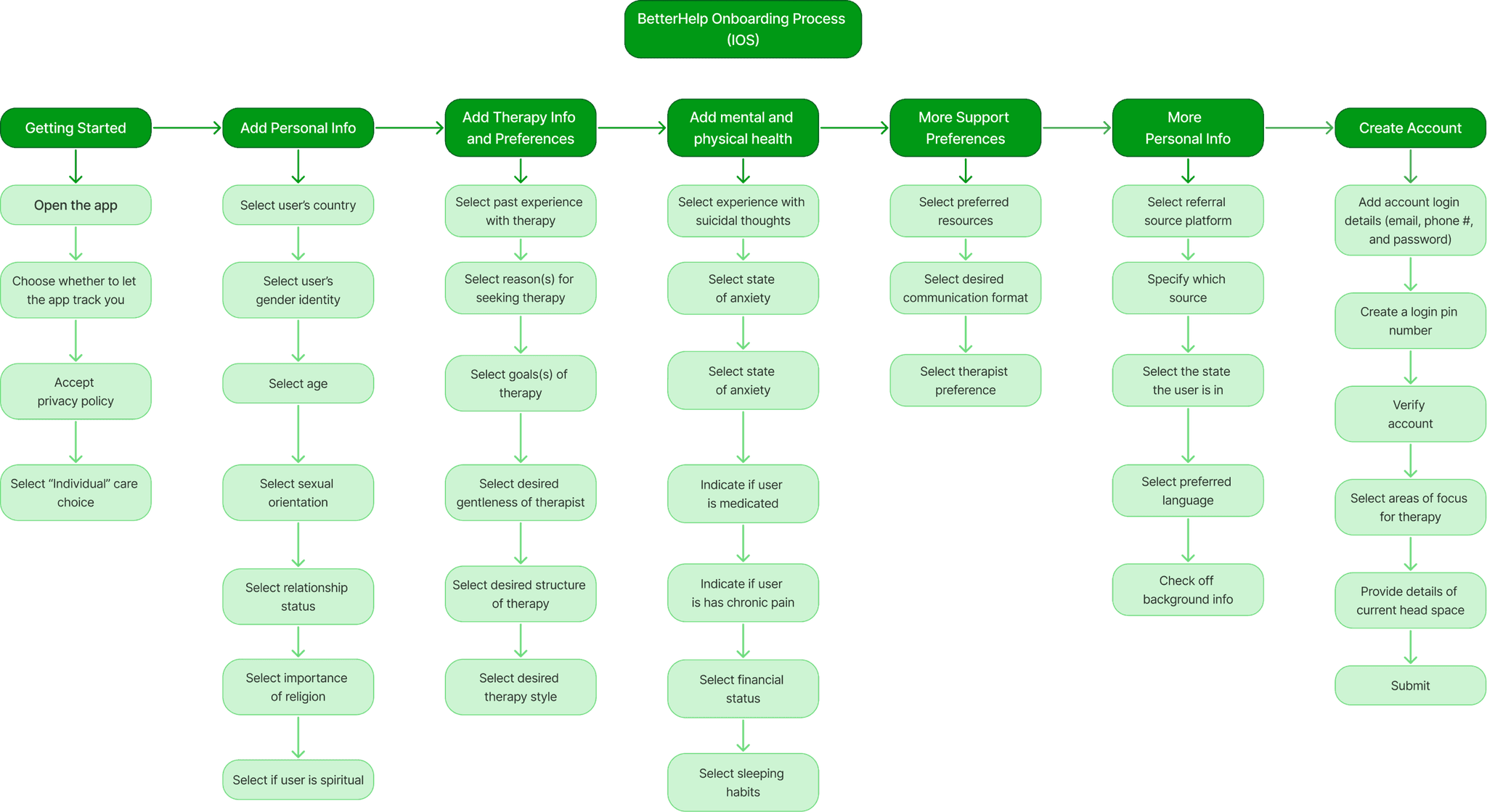
30+ Decision Points
A lengthy onboarding process
Unclear Context
Sensitive questions lack explanations
Fragmented Topics
Related questions appear across stages
Limited Navigation
Difficult to review or edit answers
User Journey Mapping
We mapped five participants' onboarding journeys to understand how friction and emotional fatigue developed throughout the experience.
Participant 01 · Representative Journey
- 01
Getting Started
Neutral - 02
Personal Information
Positive - 03
Therapy Preferences
Positive - 04
Mental & Physical Health
Neutral - 05
Support Preferences
Negative - 06
Additional Personal Info
Frustrated - 07
Account Creation
Frustrated
Unclear Progress
Users struggled to understand how much of the onboarding process remained.
Repeated Topics
Related questions appeared across different stages, making the flow feel repetitive.
Onboarding Fatigue
Lengthy and deeply personal questions increased frustration toward the end of onboarding.
Heuristic Evaluation
We evaluated BetterHelp's onboarding flow using Nielsen's 10 usability heuristics to identify usability issues and prioritize improvements.
Misleading Progress
The progress bar did not reflect actual completion.
Limited User Control
Users could not skip or revisit questions.
Lack of Flexibility
No option to save progress and return later.
Unclear Language
Some terminology lacked sufficient explanation.
Competitive Analysis
Learning from Different Onboarding Experiences
We analyzed Calm, Tinder, and Journey to explore how different apps simplify onboarding, guide users, and encourage completion.
We also gathered feedback from 15 users to identify approaches that could improve BetterHelp's onboarding experience.
Calm
Uses a calming visual style and approachable questions to create a welcoming experience.

Tinder
Uses short steps, varied interactions, and progress cues to keep users engaged.
Journey
Uses a simple, guided onboarding experience to introduce users to the app.
Task Flow
Feature Comparison
| Category | Calm | Tinder | Journey | BetterHelp |
|---|---|---|---|---|
| Getting Started | Gentle introduction | Simple signup | Guided setup | Personal questions early |
| Question Structure | Short, focused questions | Varied interactions | Minimal questions | Long, repetitive flow |
| Visual Design | Calm, minimal | Clean, engaging | Soft, minimal | Minimal but repetitive |
| Guidance & Progress | Limited guidance | Progress cues | Introductory guidance | Unclear progress |
Key Insights
01 — Manageable Steps
Break lengthy onboarding flows into smaller, clearly grouped sections.
02 — Supportive Feedback
Use reassuring feedback to make the experience more encouraging.
03 — Clear Progress
Help users understand where they are and how much is left.
Design Strategy
Making Onboarding More Manageable
Based on our research findings, we focused on simplifying the onboarding flow, improving navigation, and giving users more control over their progress.
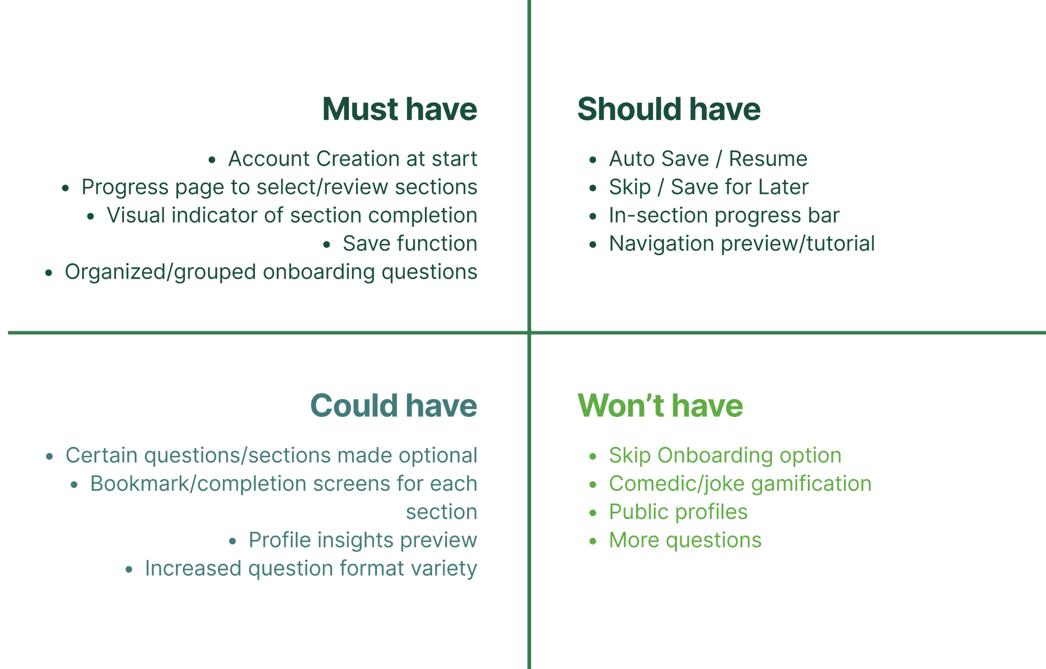
Feature Prioritization
We broke down complex onboarding issues into smaller, actionable opportunities, prioritizing clarity, flexibility, and reduced cognitive load.
Restructuring the Onboarding Flow
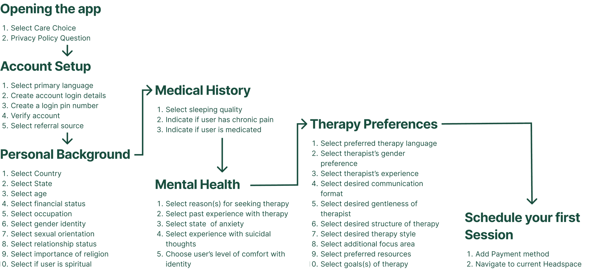
We reorganized related questions into clear stages and moved account setup earlier to support saving progress.
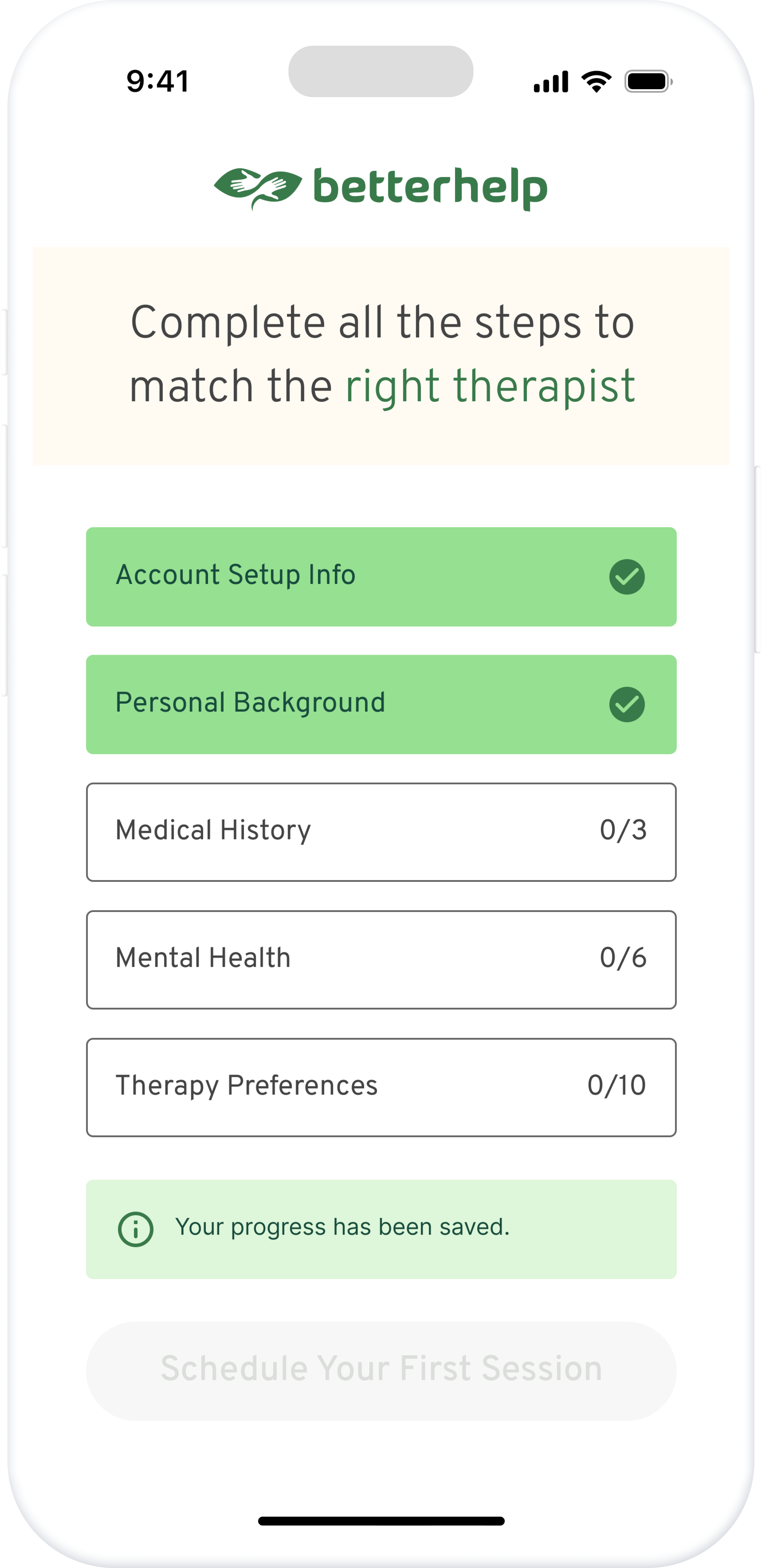
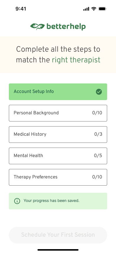
This structure laid the foundation for a central navigation screen where users could track progress, revisit sections, and complete onboarding at their own pace.
Design Exploration
Exploring a more structured and flexible onboarding experience.
Based on the key pain points, we explored two parts of the redesigned flow: a navigation hub that makes onboarding easier to manage, and in-section support that helps users track progress and return later.
Key Pain Points
Overwhelming Flow
The long onboarding flow felt overwhelming, especially as topics shifted between practical setup and more personal questions.
No Save & Return
Users had to complete the entire flow in one sitting, with no way to save progress and return later.
Unclear Grouping
Questions were not clearly grouped, making the process feel harder to follow.
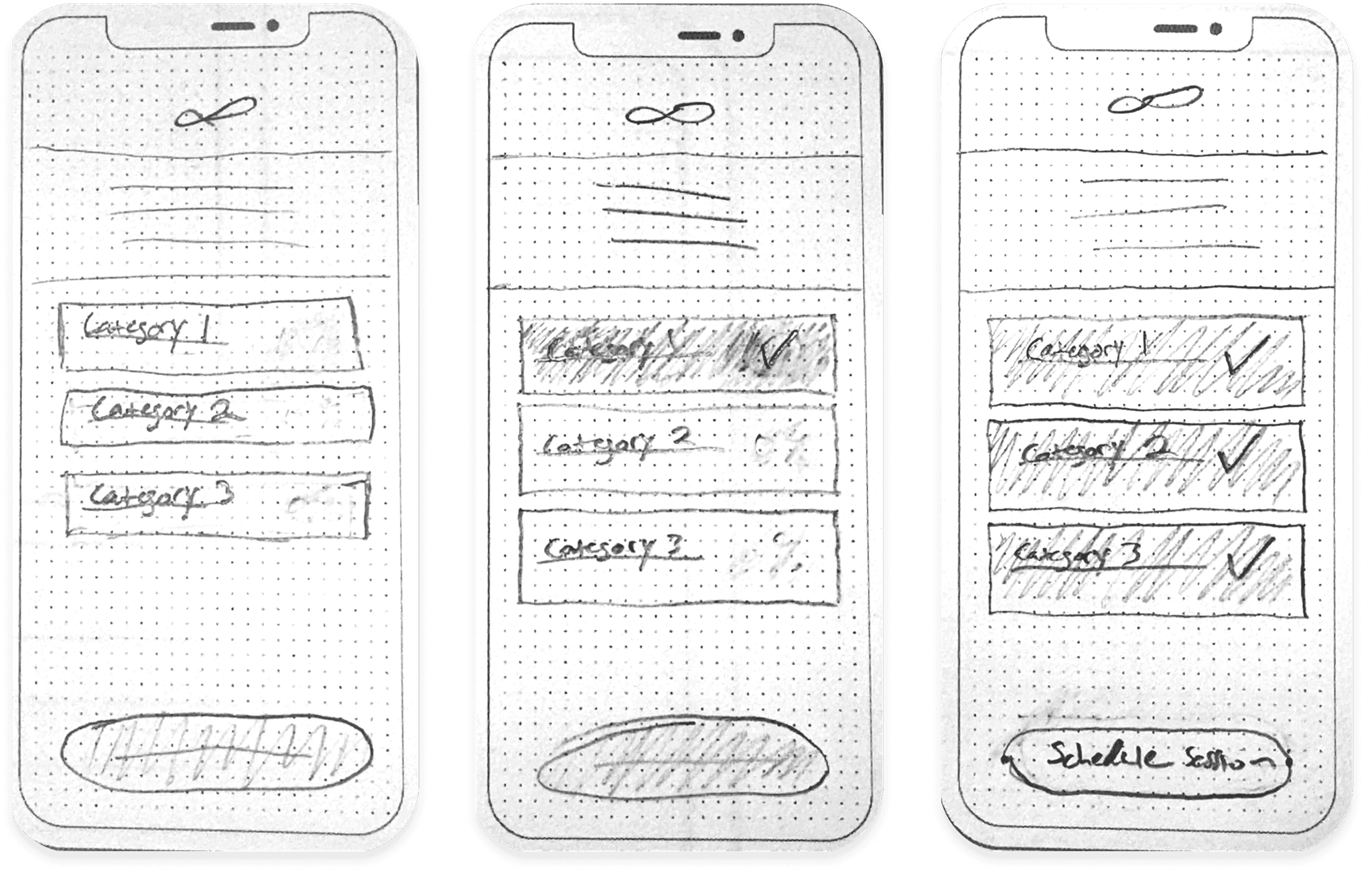
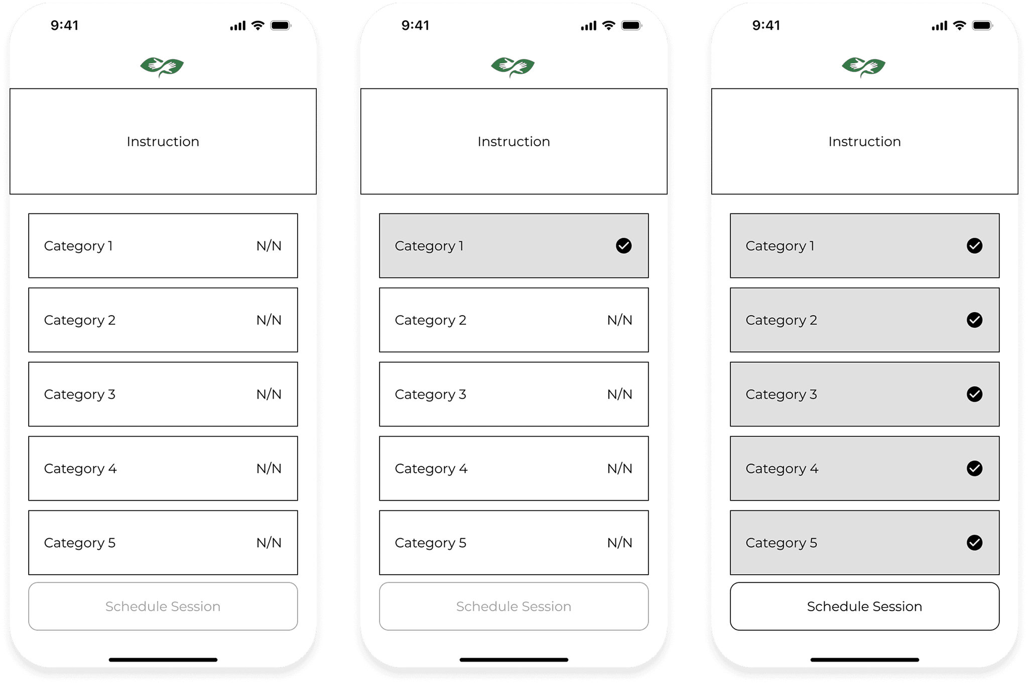
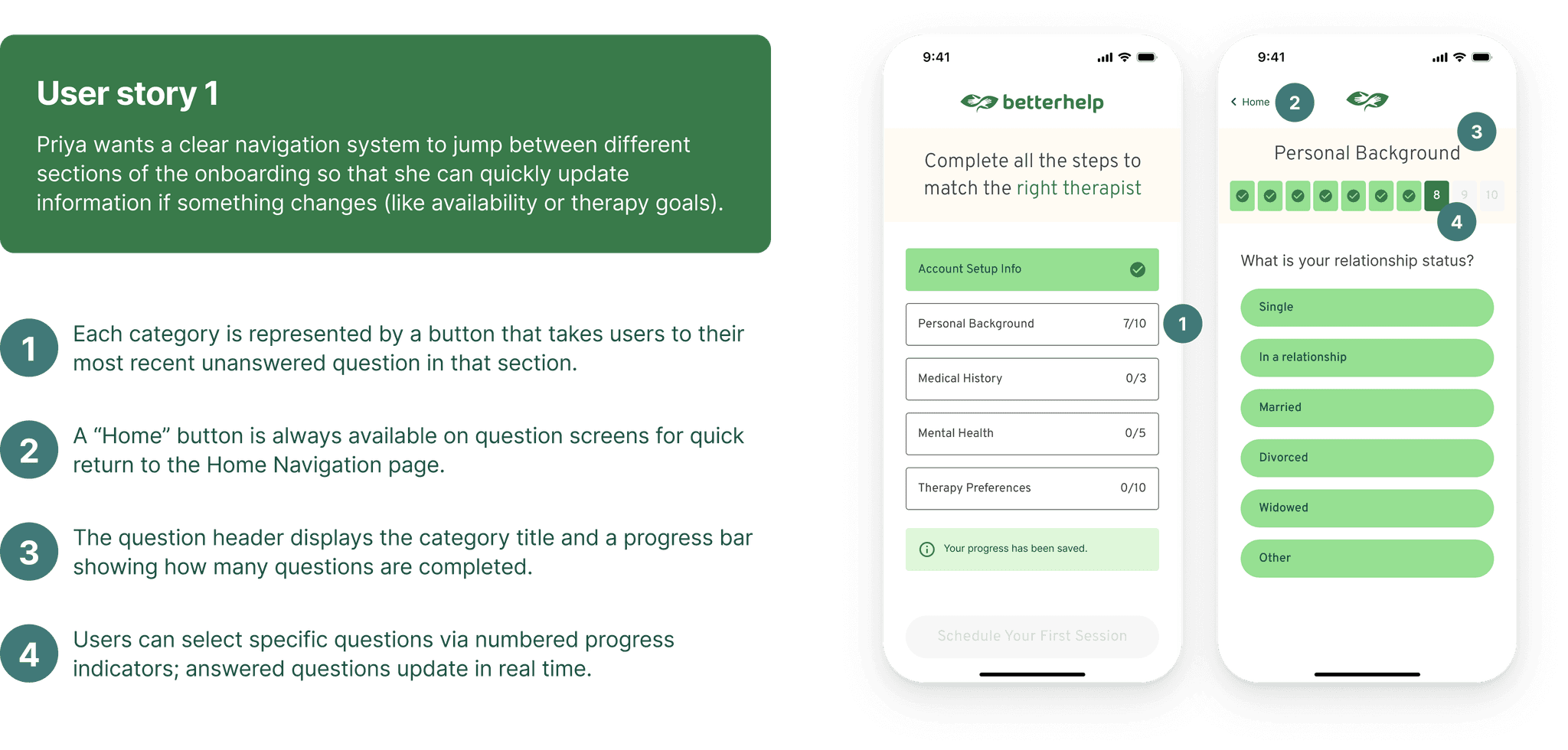
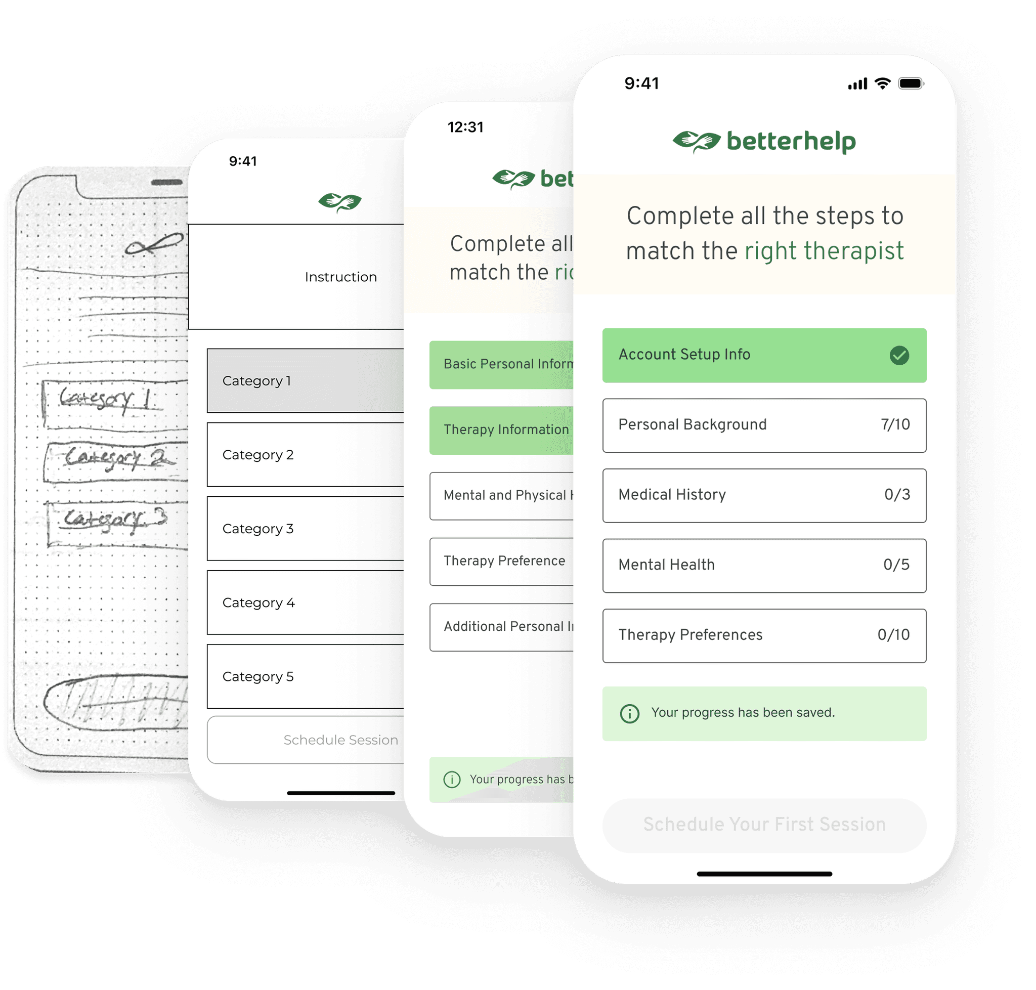
Exploring a Navigation Hub
To reduce cognitive load, we explored a home screen that helps users better understand the onboarding structure and move through it more intentionally.
- Group related questions into clear sections
- Let users enter or revisit specific sections
- Show which sections are complete
- Keep the “Schedule” action disabled until all required steps are finished
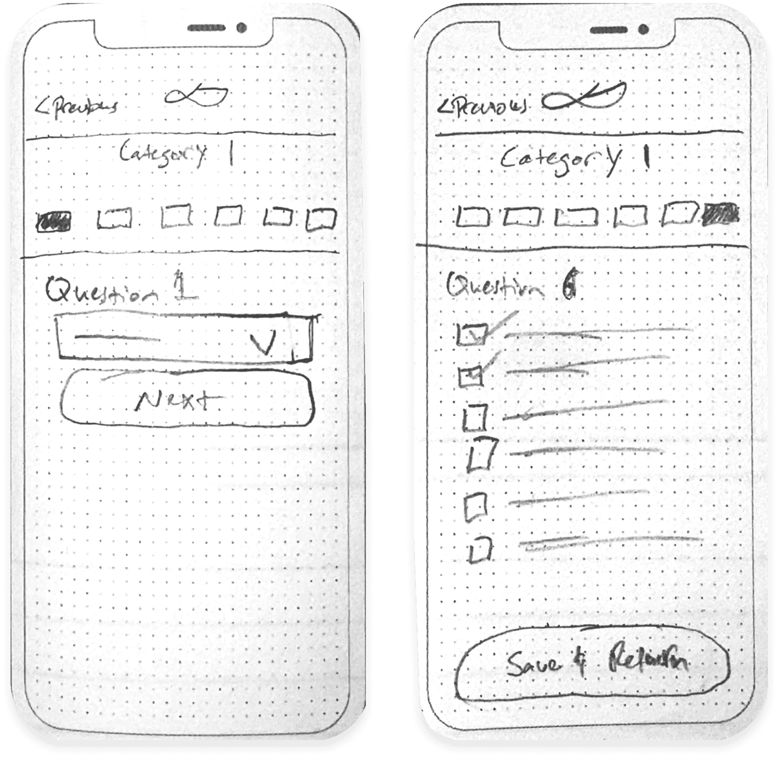
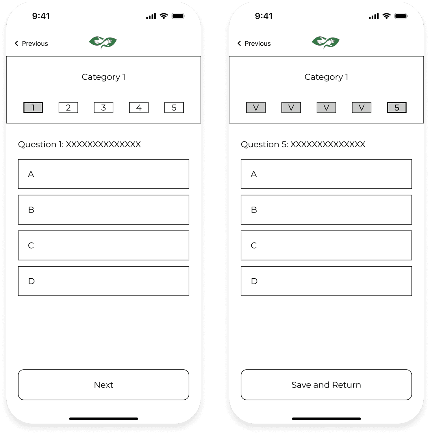
Exploring In-Section Support
Within each section, we also explored ways to help users feel more in control while completing the flow.
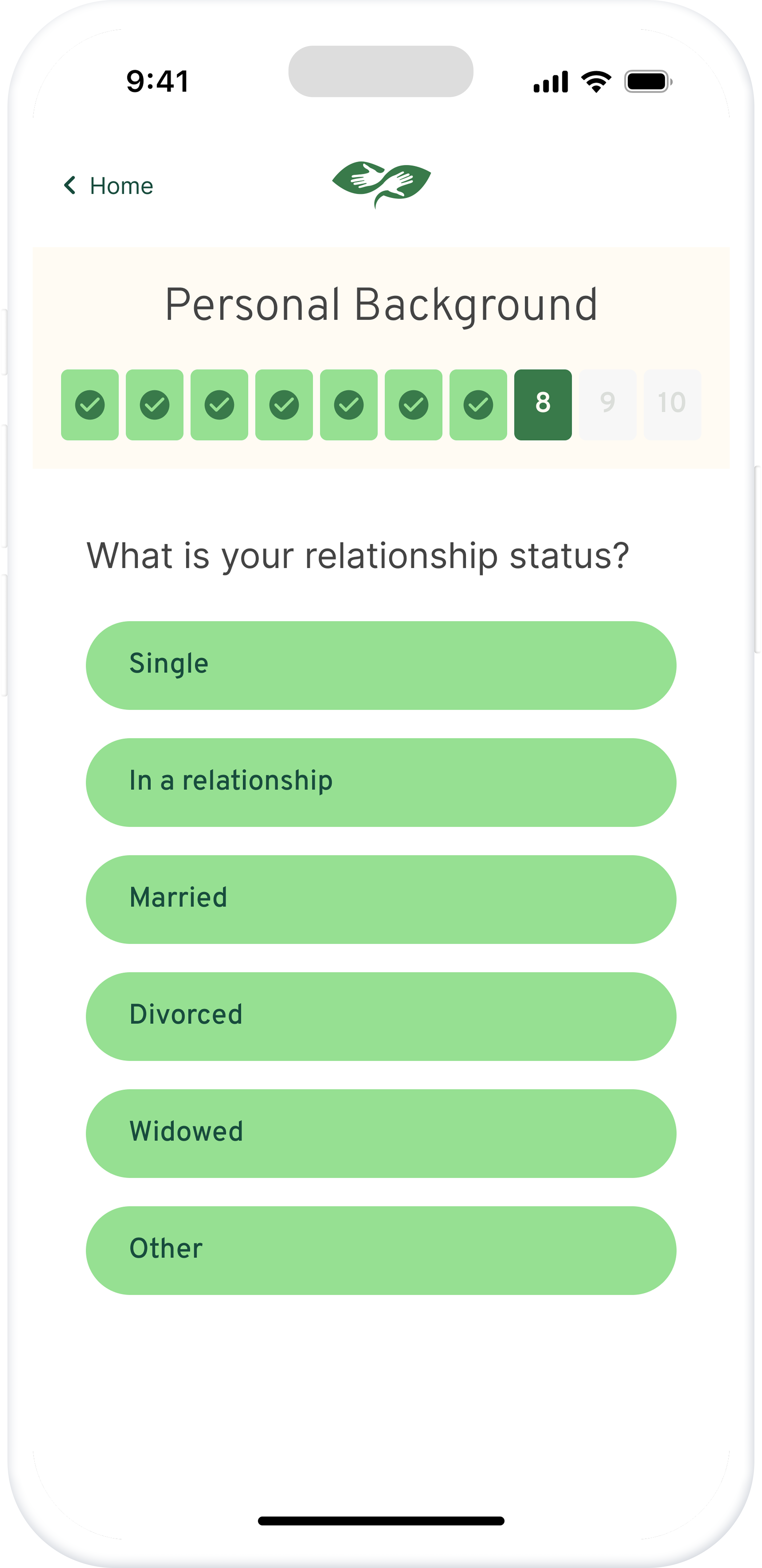
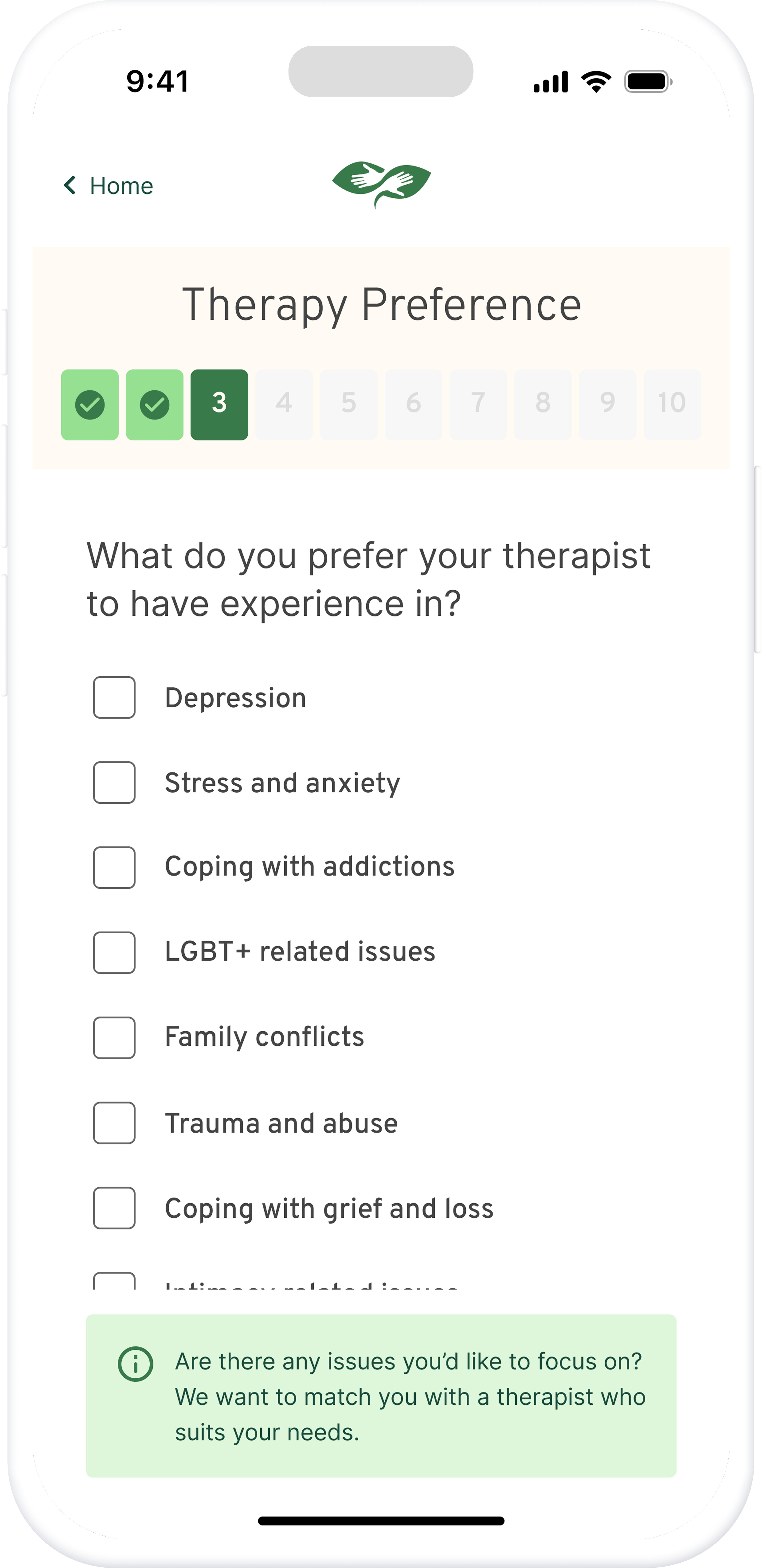
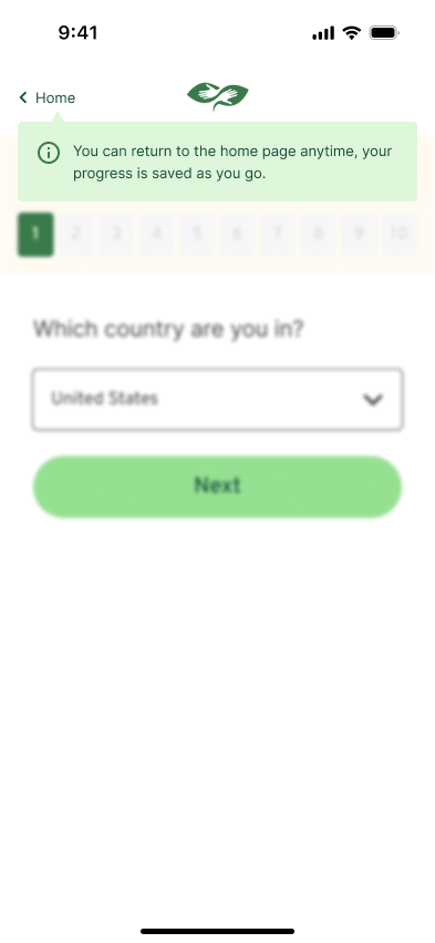
- Use progress indicators to show where users are within a section
- Add a “Save & Return” function so users can pause and resume later
Design Iteration
VERSION 01
Section-Based Navigation
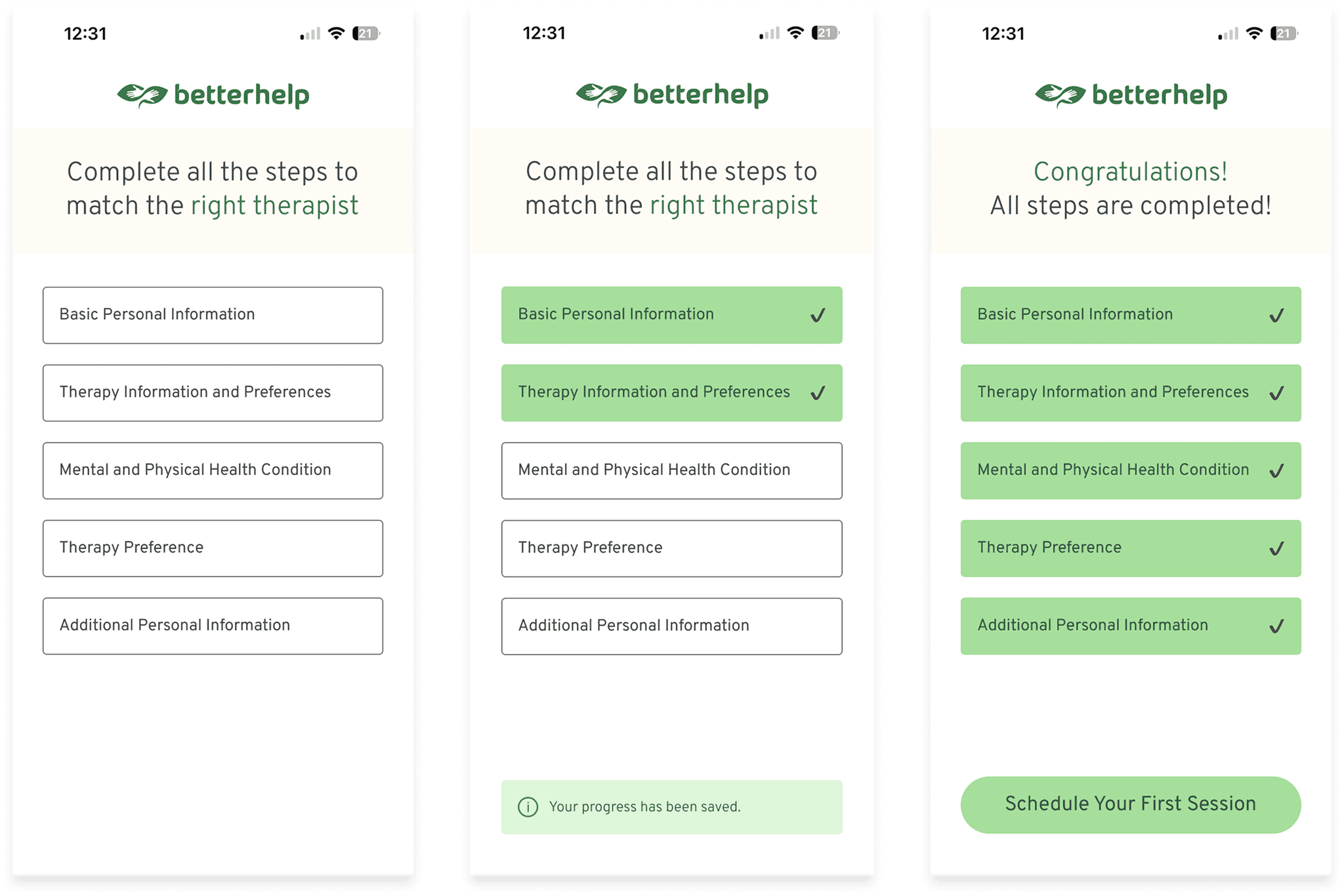
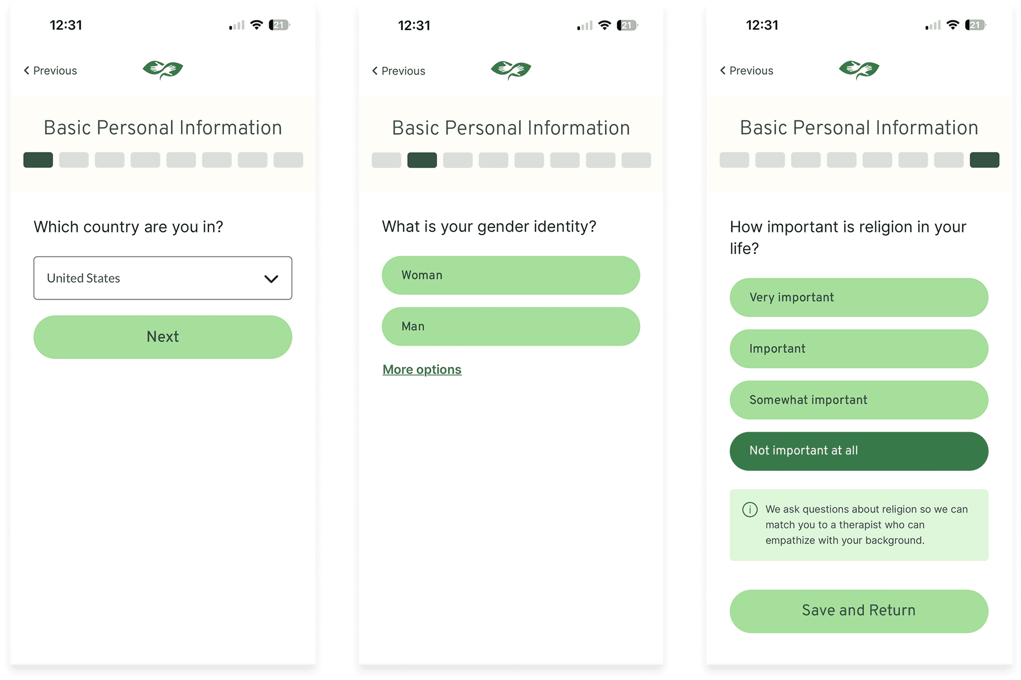
USER FEEDBACK
Users struggled to understand the clickable progress tabs and remaining steps.
DESIGN RESPONSE
Added question numbering to improve progress clarity.
VERSION 02
Improving Progress Clarity
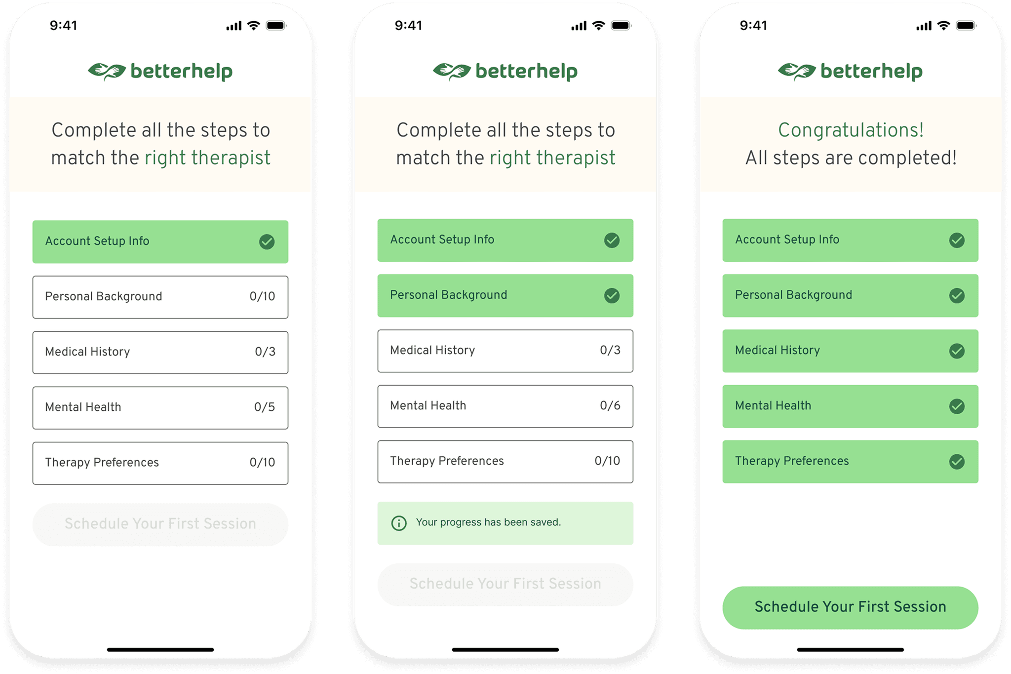
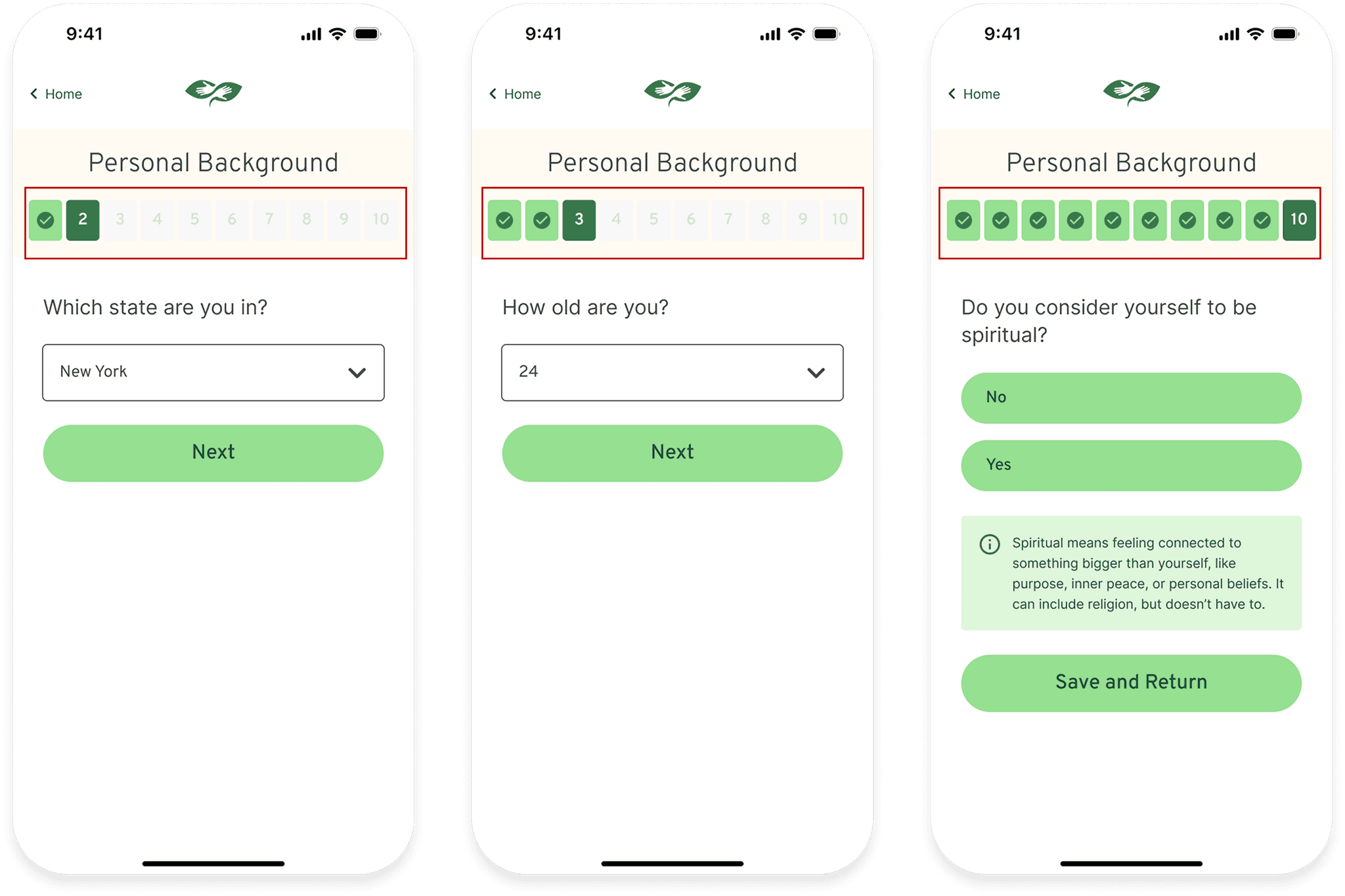
USER FEEDBACK
Users still overlooked navigation controls and automatic progress saving.
DESIGN RESPONSE
Introduced contextual guidance to explain navigation and save behavior.
VERSION 03
Making Navigation Discoverable
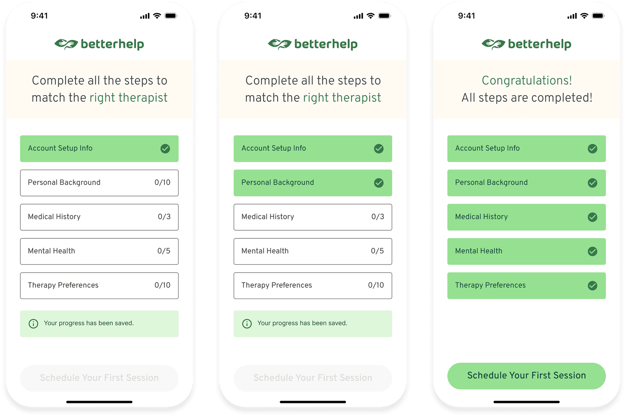
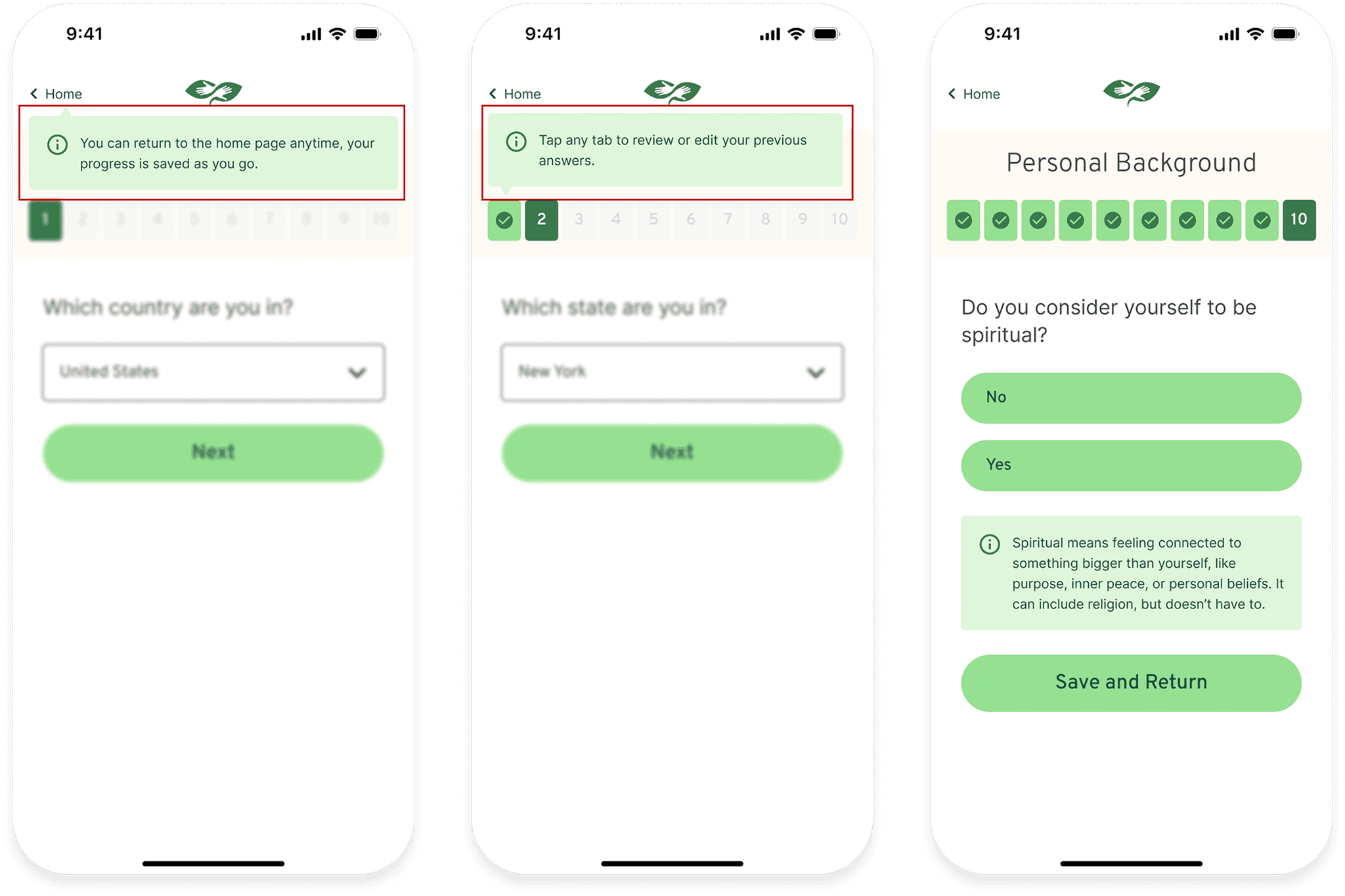
FINAL FEEDBACK
Participants responded positively to the clearer navigation and progress feedback.
OUTCOME
Retained the new guidance and refined the final experience.
Final Design
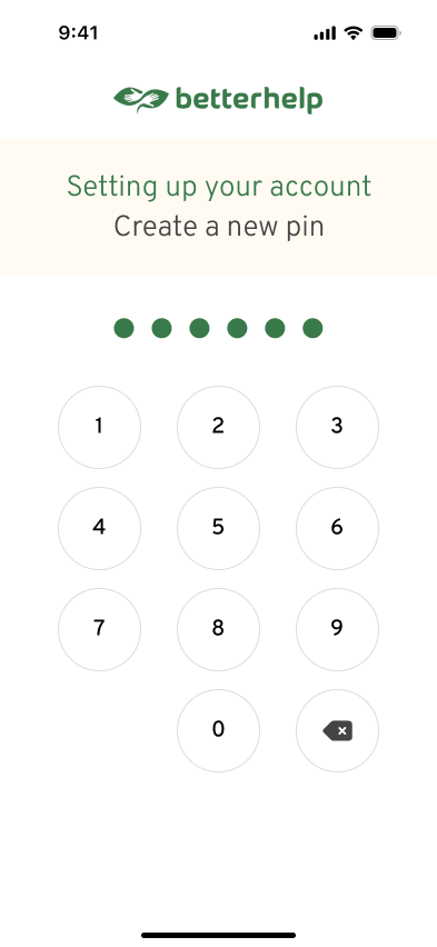
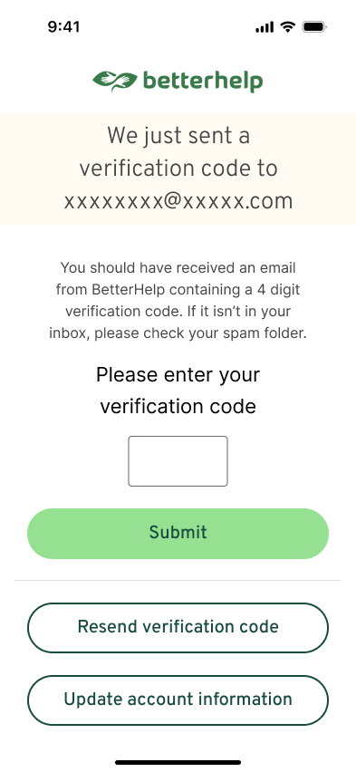
Onboarding that users can complete at their own pace.
Grouped Questions
Clear sections keep related questions together.
Visible Progress
Know where you are and how much is left.
Save & Return
Pause onboarding and resume at your own pace.
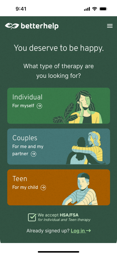
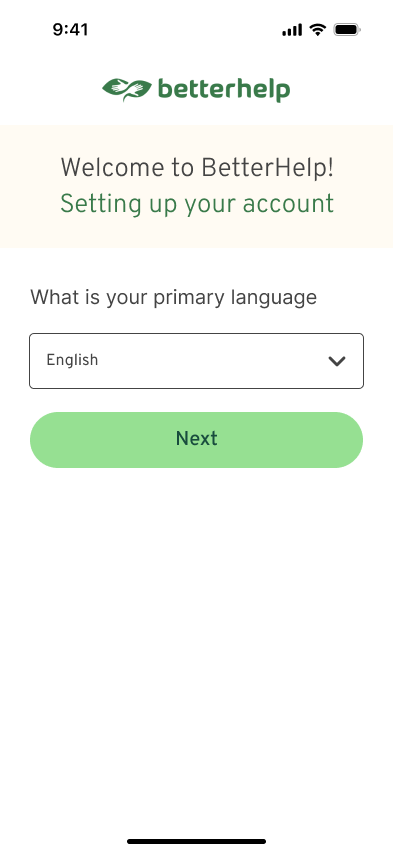
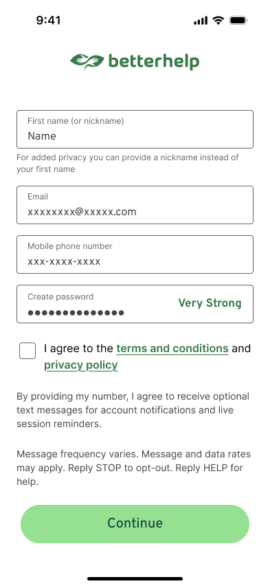
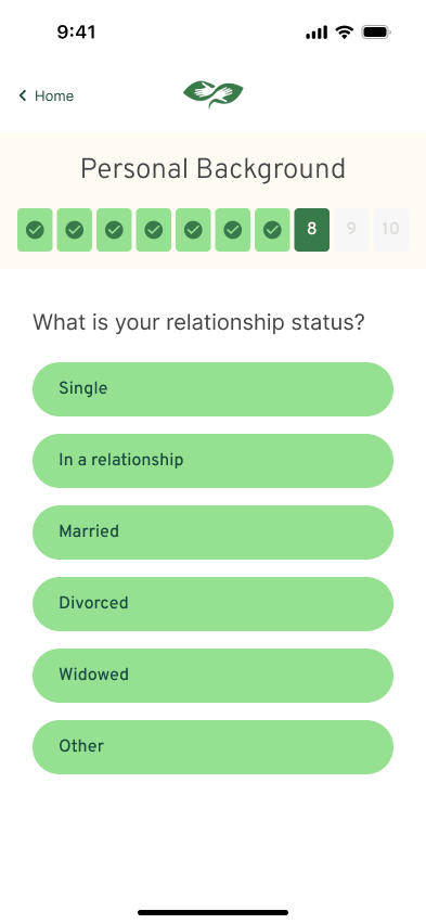
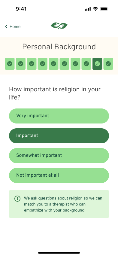
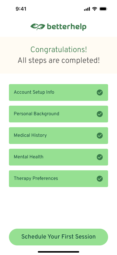
Key Screens
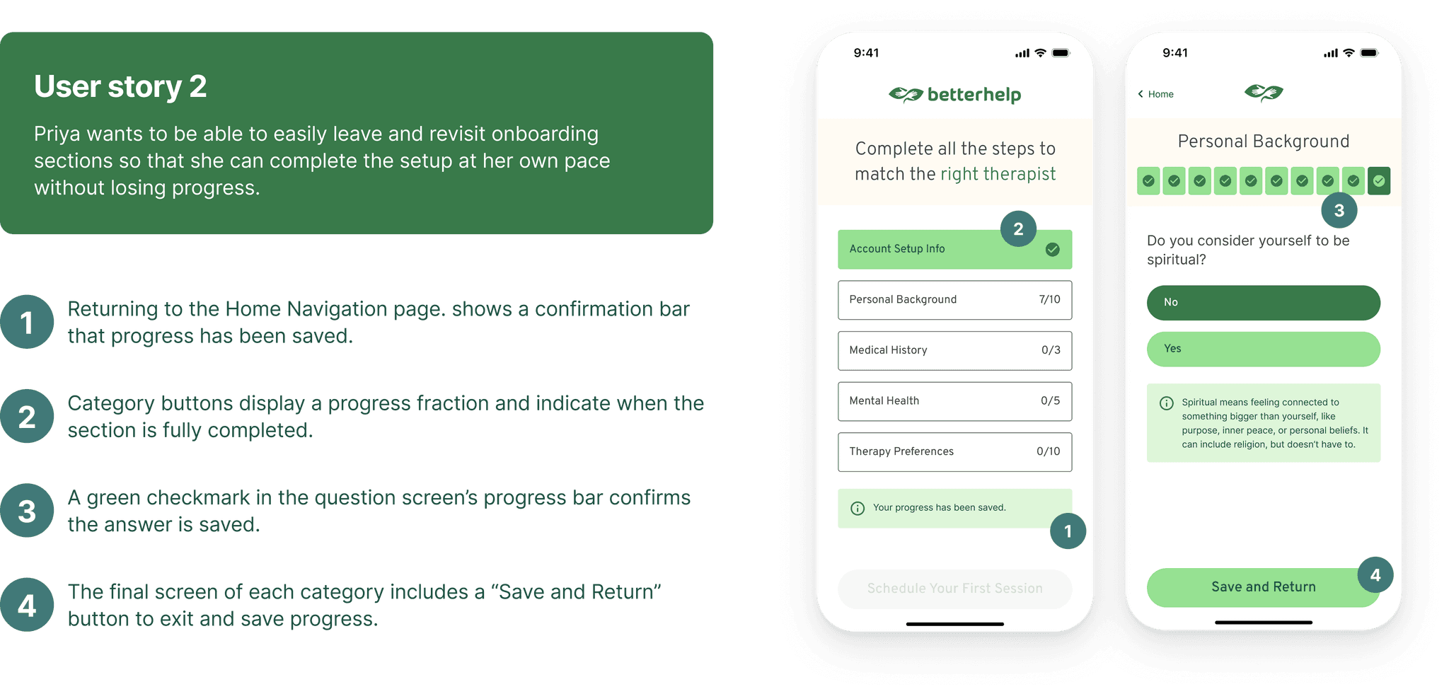
User Flow
Design System
Components
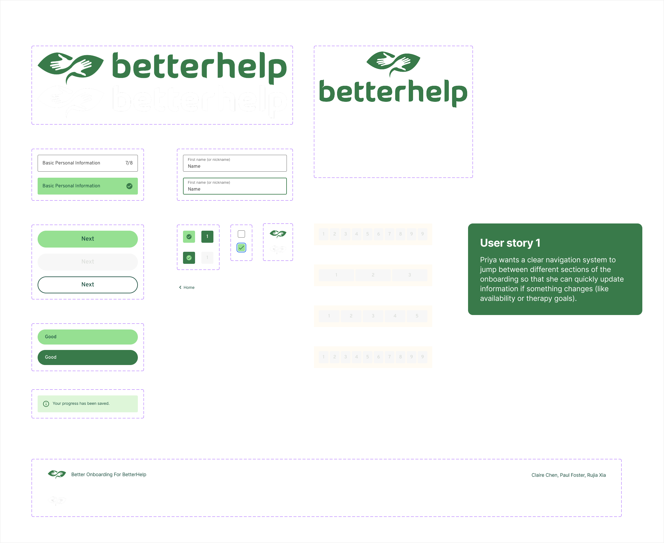
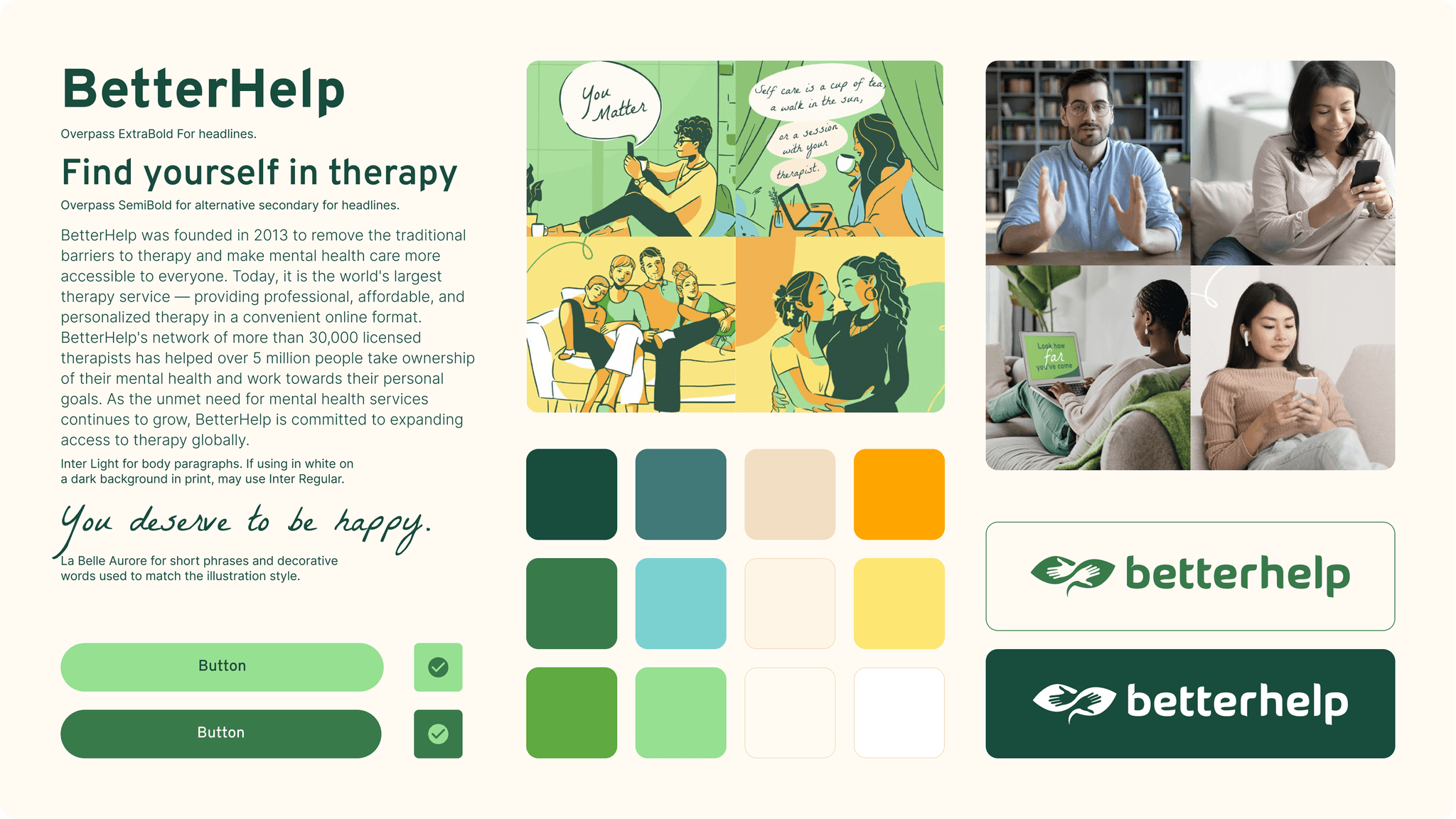
Style Tile
Impact
A Clearer, More Flexible Onboarding Experience
FINAL TESTING ROUND
5/5Participants received positive ratings across all four usability criteria in the final round.
Clearer Navigation
Easier movement between sections
Progress Visibility
Better understanding of completion
User Control
More flexibility to save and return
Next Steps
Continuing to support users through onboarding.
While our focus was on improving navigation within the onboarding experience, our research uncovered other meaningful opportunities to explore. Potential next steps include:
Reevaluating the tone and wording of onboarding questions based on user feedback
Testing motivational screens or micro-interactions to reward progress
Exploring adaptive onboarding flows tailored to each user’s context
Takeaway
Let User Feedback Guide the Design
Usability testing taught me that what seems intuitive to designers isn't always clear to users. Continuous feedback helped us identify overlooked issues and make more informed design decisions.
Collaborate With Clear Ownership
Working in a team of three taught me how clear responsibilities and a shared design direction can improve efficiency while maintaining consistency across the experience.
Connect User Stories to Solutions
I learned the importance of linking user needs directly to design features, making our decisions easier to understand and communicate.
Acknowledgments
Special thanks to Professor Kojo Boateng for his guidance, Rujia for the presentation design, and Paul for refining the report.